


An app that allows people to order, favorite, and talk about coffee in a simple, unchallenging way.
Duration: Nov. 2020 - Jan 2021
Team/Role: Design Team Of One
Category: Passion Project Case Study
Brief
Problem
This coffee delivery app is going to be a passion project of mine because of the amount of issues I personally have ran into and I've heard others complain about. I honestly believe I have a caffeine addiction just like most Americans and however I can get that cup of joe into my hand easier would make my day so much better. Below is a brief overview of the process
Who's the audience?
What problems do they have?
How often do they run into these problems?

Competitive Analysis
Interviews
Surveys

Brainstorm Ideas
App Mapping

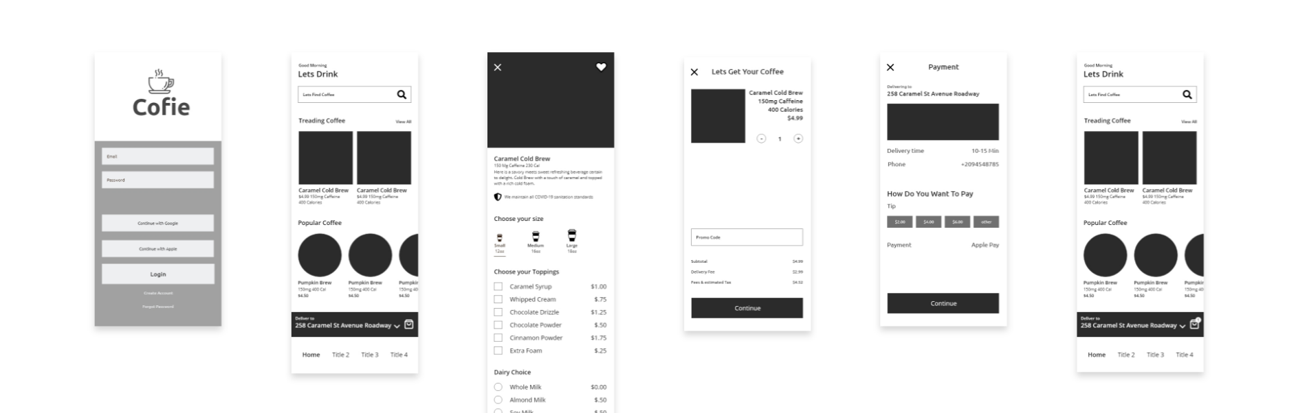
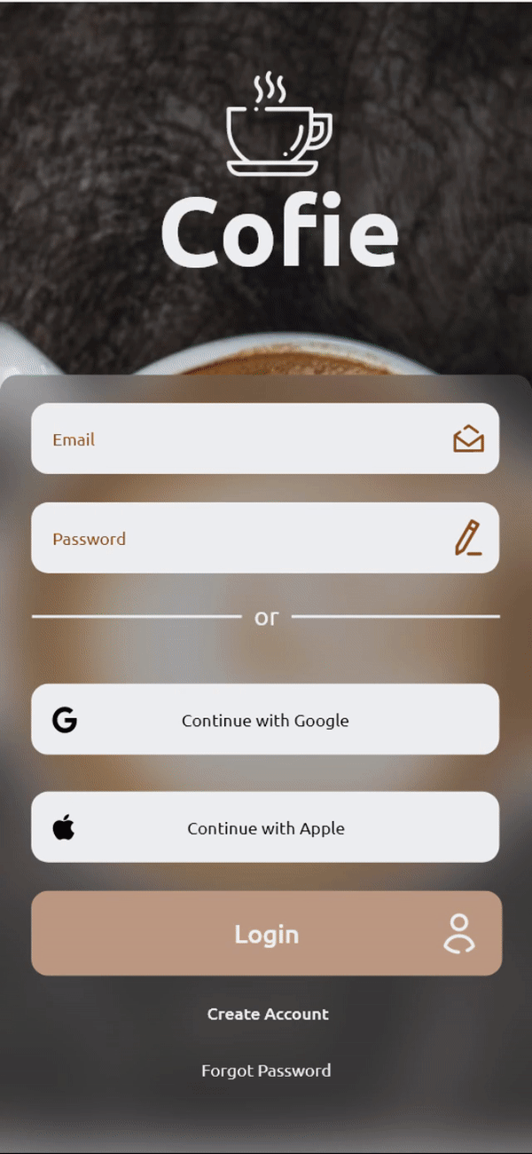
Wireframe
Prototype
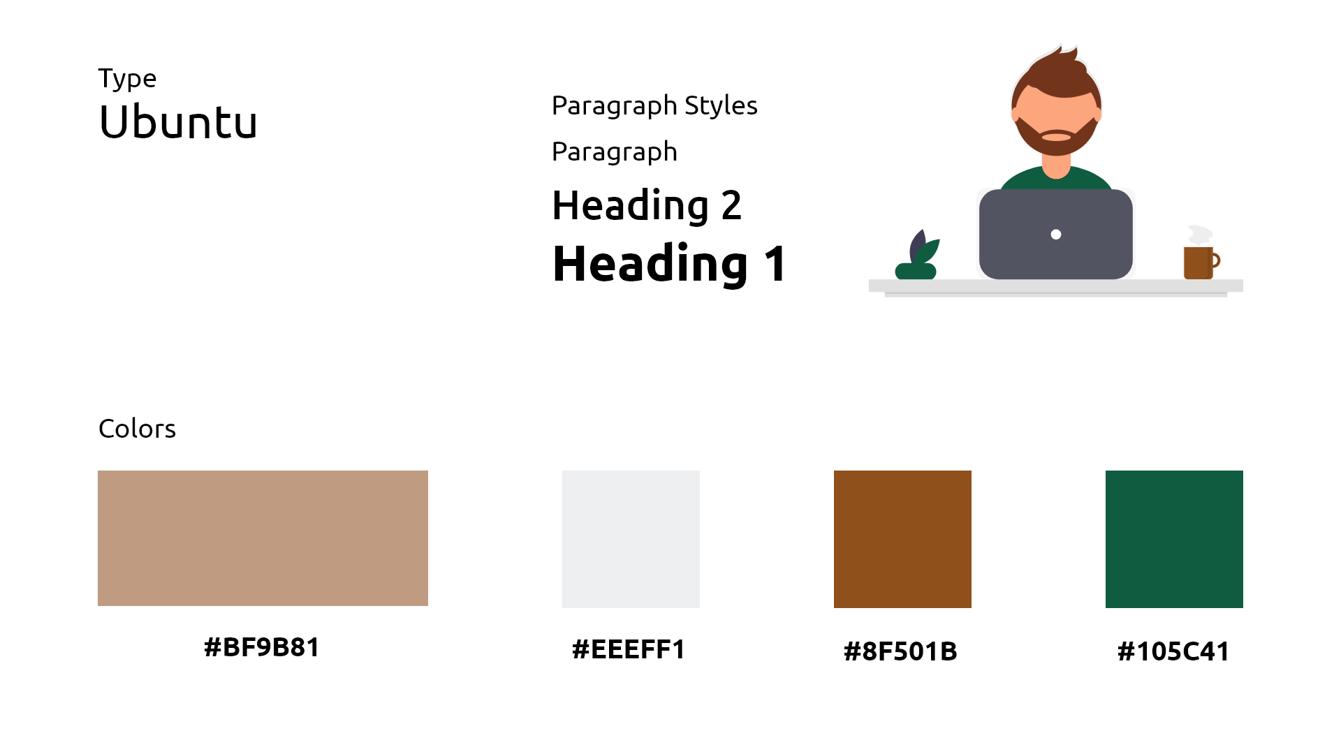
Style Guide

Assets Tradeoffs
User Testing
User Interviews

Its time to take a deep dive into seeing the problems other users have run into or if they ran into the same issues I had.
I began by asking those who are coffee lovers and also have a caffeine addiction. I believe its best to ask those who use the app the most and see what their general responses are and see where their frustrations are at.
"I'd like to see how much caffeine each coffee contains to gauge my caffeine intake."
"I'd like to adjust the size of the coffee, and quantity of espresso to customize it for me"
"I'd like to adjust milk/dairy alternative since I'm lactose intolerant"
"I'd like to save my coffees to my favorites for easier access"
"I'd like to see a photo of the coffees available in the app so I can set my expectations"
I looked into the competitors to see where their customers frustrations and any other problems their customers have. Doing this allowed me to see the pain that others experienced and make design decisions based off people's needs and what they are missing from the coffee places they already go to and possibily convert them.
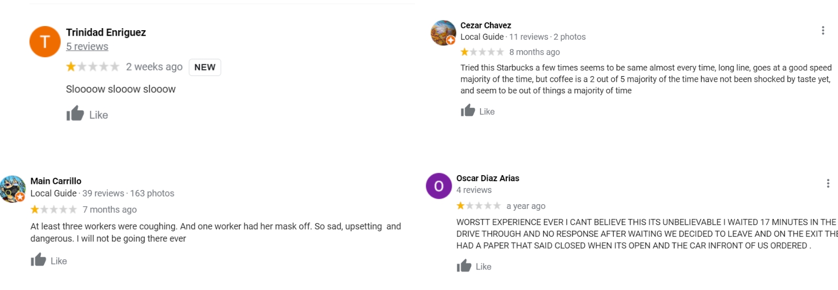
Looking through reviews and asking people what type of experience they want from the app it seems like they sure care about time and how their coffee is made. This information was actually very helpful because now I understand that usually people like to know how long their wait is and have issues if it's too long without any acknowledgement. I also see where competitors are lacking and I can use this information in the app so we can have something over the competitors.
Its time to reflect on the information I gathered and come up with ideas and solutions to the problems users have had.
Using the reviews and questions I asked people, I started to create ideas and features the app could have that was an issue people had with competitors. At this point I was writing down whatever ideas came to mind and didn't organize them until the next step.
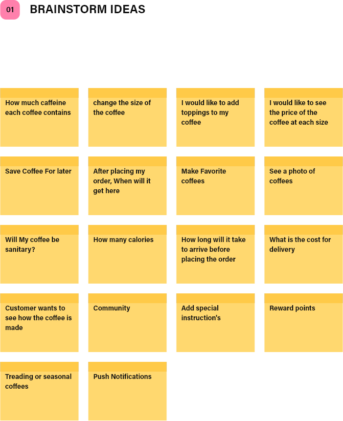
I then started organizing the ideas given to me and determined which areas of the app they were best placed in for the best interaction. I also wanted to start thinking about the journey the user will go through after each interaction.
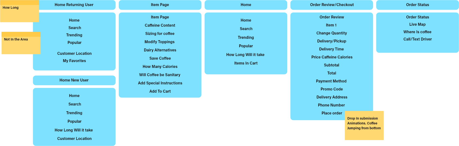
Looking at the research I have done I came to realize the main features this app needs if it stands a chance with its competitors. It seems like having an open communication with the driver/barista and a clear indication on the time are very important features and something I will take into consideration in the design.
After debating what information would be the best place where I then started having trouble how the information would best be displayed. Deciding on which information would best be displayed where and which would take the visual hierarchy.
I created a style guide I thought best suited for coffee lovers. A lot of the colors I picked are already being used in other shops or colors people are used to. I also wanted a style where it makes you feel inviting and cool colors.
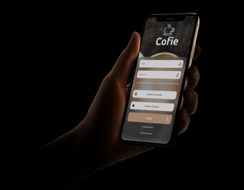
The less clicks a user has to make to make a purchase the better. I mapped a clear and simple way the user goes from the home screen to purchasing a coffee so there wouldn't be any confusion or a reason not to buy one.
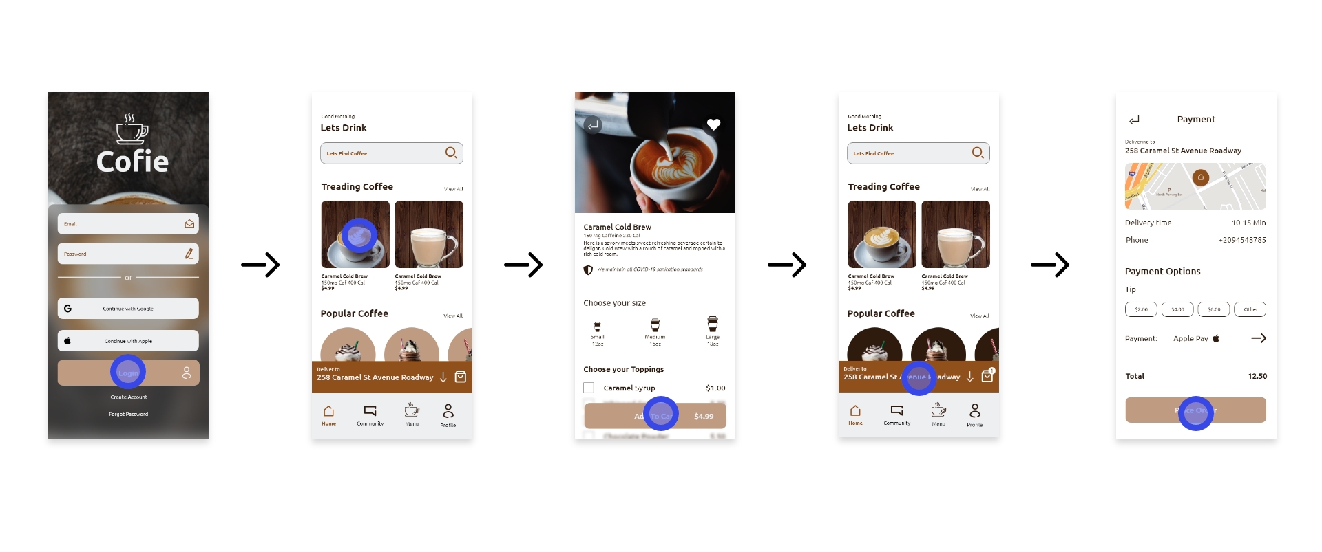
From the research it's clear that customers need to know how long the coffee will take to get to the user and have open information about the driver. Not showing where the driver and not having easy access to contact them seemed to be a majority of the problem people had.
User Story 1 "I'd like to adjust milk/dairy alternative since I'm lactose intolerant"
User Story 2 "I'd like to see a photo of the coffees available in the app so I can set my expectations"
User Story 3 "Sloooooooww slooooooowww sloooooww"
This project has taught me a good amount about customer service and how they would like to prepare their food or drinks. I also learned how to look for what other competitors were lacking in. I believe what helped the most was the actual reviews I pulled from google because people don't usually like to talk down the local coffee shops and the reviews are unfiltered
To be honest, I spent too much time on trying to do different type of designs and interaction with the app. This only confused users and made them press on buttons they didn't want to touch or go to pages they didn't intend to go to. Don't fix what isn't broken.