


Duration: Jan. 2022-April 2022
Team/Role: Designer/Developer team of one
Category: Learning Website
Brief
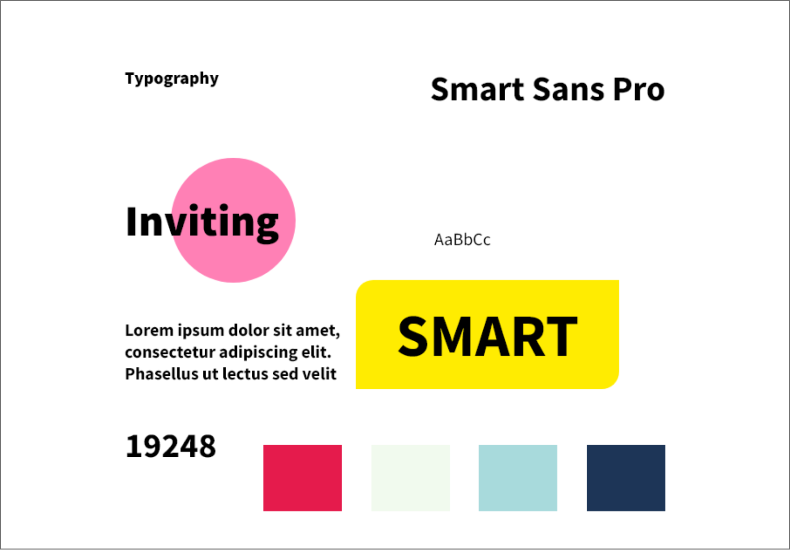
While designing the website, I have passed different steps and phases from choosing our typography and colors that reflect E-Design brand Identity and make the user feel trusted and reliable to test and define the final version.
Its time to take a deep dive into seeing the problems other users have run into or if they ran into the same issues I had.
I started this interviewing process by asking those with already accounts on competitor sites and asking what keeps them on the site and what the competitors can do to do better.
"I like how the website never makes it feel like a lesson and how I go at my own pace."
"I always felt invited and like I wasn't getting scammed"
"The websites are very clear on how much I would be paying and what services they provide"
"What I like about the website I use is that there no advertisement to spend more money."
"Classes are organized amazingly."
After interviewing, I have came to realize that site visitors want a clear and fun experoe with education websites. They want a clear message on what the website offers and how it can improve their skills.
After completing the research I have came to the conclusion that a majority of the audience that use educational websites want to learn but also not be bored. I will need to take into consideration how much information the owners wants on the page and how to make the website inviting.
Using the reviews and questions I asked people, I started to create ideas and features the app could have that was an issue people had with competitors. At this point I was writing down whatever ideas came to mind and didn't organize them until the next step.
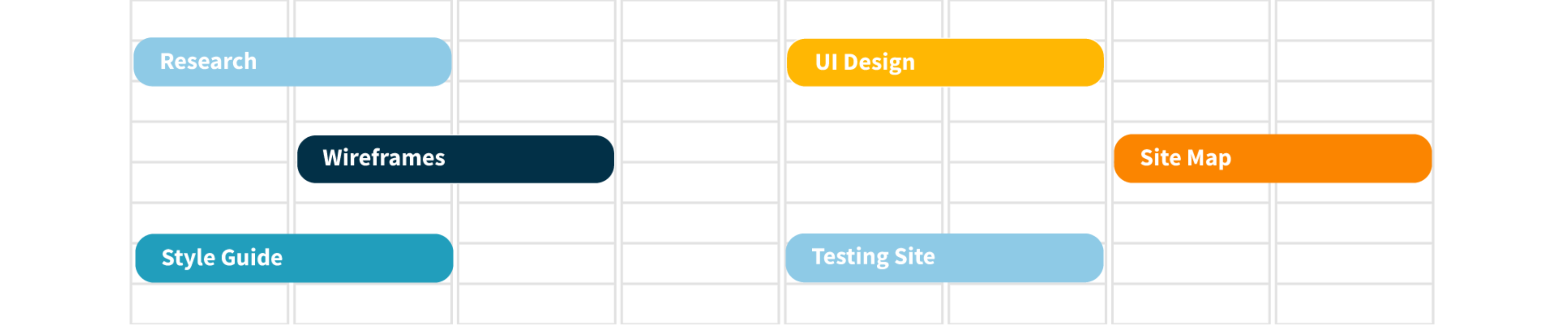
After communicating with the sites owner, I organized the content they wanted on each page. I started brainstorming ideas on how I wanted they layout to be and how I want the information to be displayed.
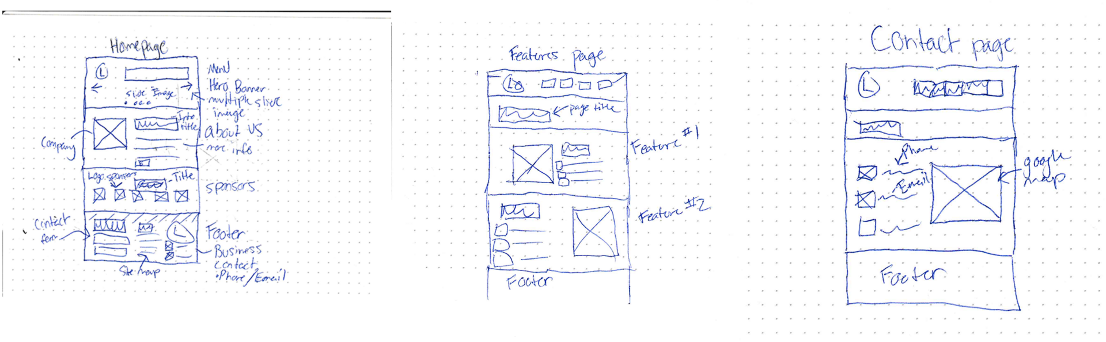
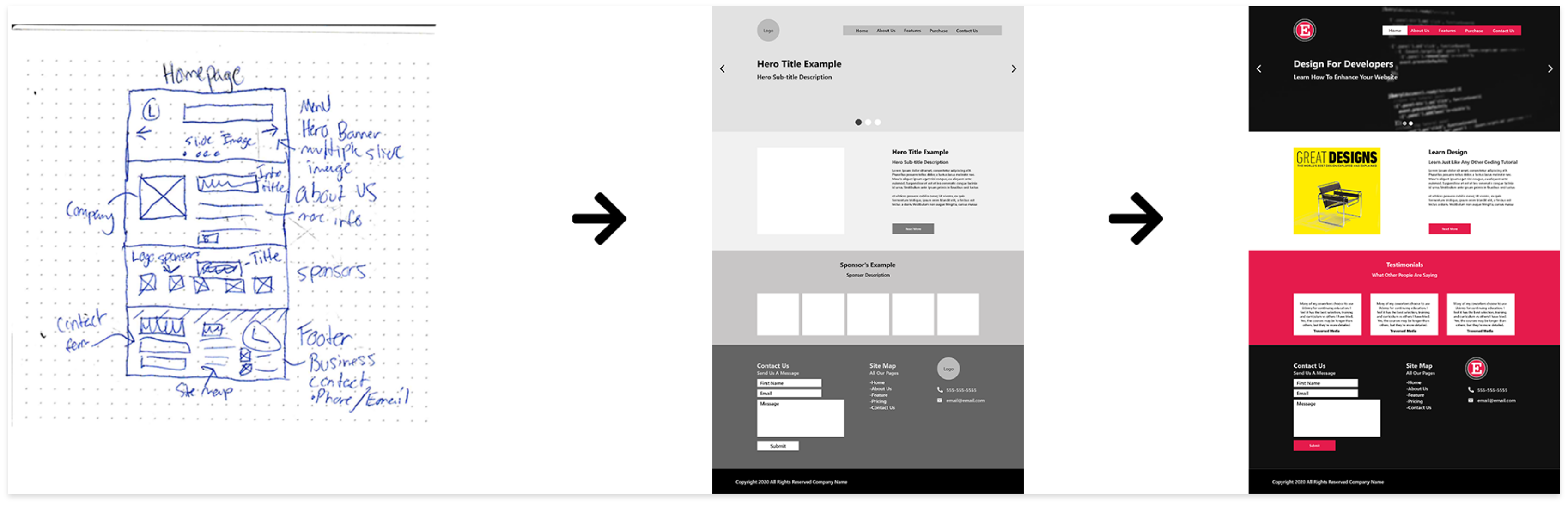
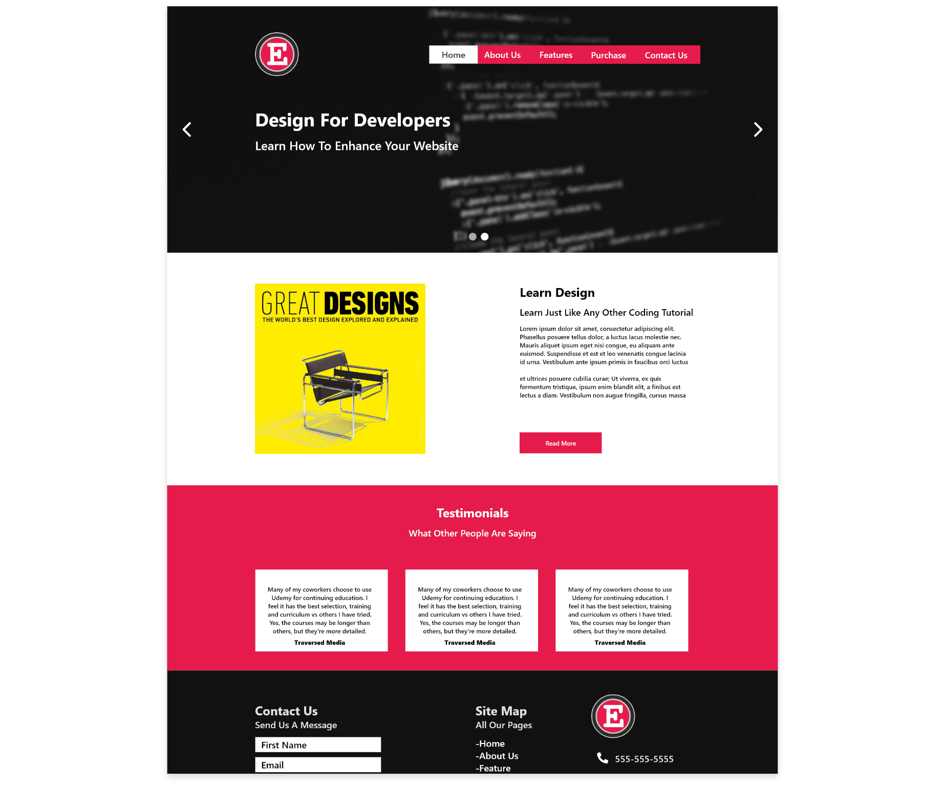
Before I created more of the project I wanted to experiment how the homepage would do with the information and wireframing I did.
"There's not an easy way to find what the page selling"
"The site doesn't look as fun as I'd like it too"
"The second section feels like an advertisement"
Unfortunately, the first attempt at a homepage didn't go as expected and I've gotten a lot of negative feedback. I went back to the drawing board and discussed with the site owner on the steps moving forward. I am going to try a different approach to the page and redesigning from the ground up.
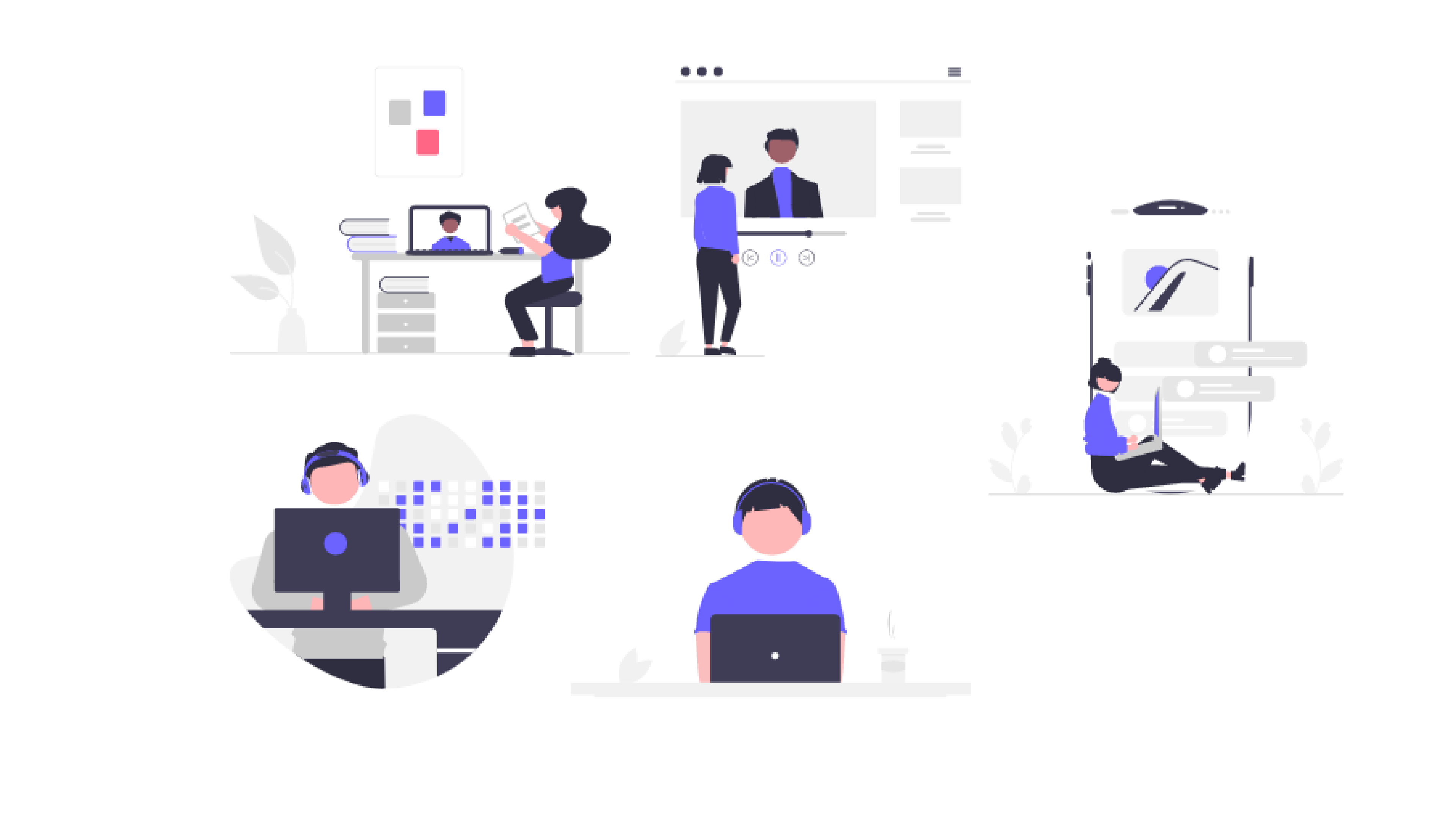
I've decided to add illustrations to the page due to the page not being inviting enough. The quote "The site doesn't look as fun as I'd like it too" really inspired me to take an approach with this. Also, by lat other competitors sites I believe this would be an appropriate action to take.
This project has taught me a good amount about customer service and how they would like to prepare their food or drinks. I also learned how to look for what other competitors were lacking in. I believe what helped the most was the actual reviews I pulled from google because people don't usually like to talk down the local coffee shops and the reviews are unfiltered
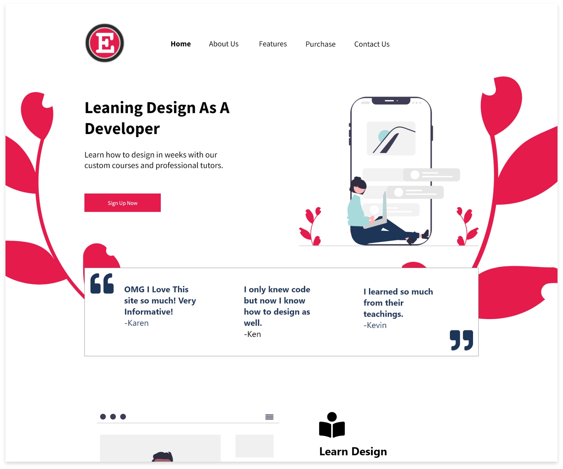
With this feedback, I went back to the header and create a call to action button so the customer can understand what the page is trying to sell.
For the second section, I took out the book cover and replaced it with an illustration so the customer can get an idea of what signing up would be like. I also added some more information on the product below it so it won't feel as bland.
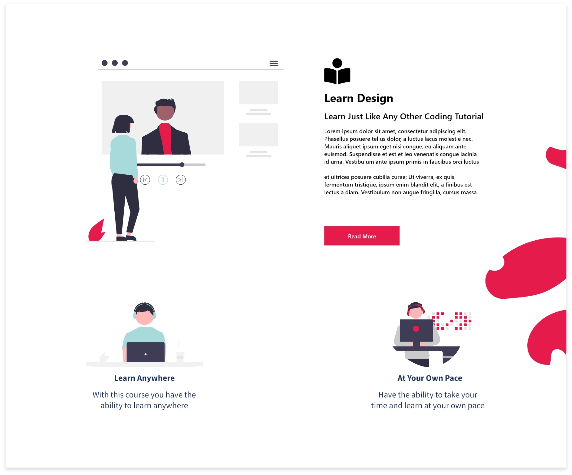
I've came to the realization that I should take a second to get a better understanding of what is considered inviting to customers. After taking into consideration more of my style guide and how the customer would feel I created a better homepage after all.